Graphic Design
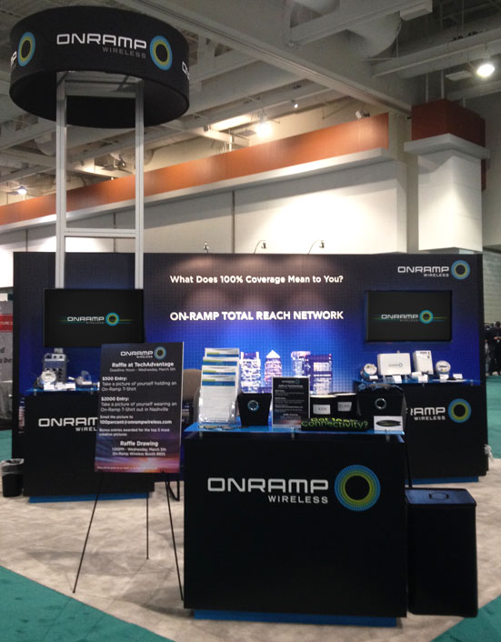
After revamping the marketing brochures and creating an unique style for On-Ramp Wireless we moved forward to creating new trade show materials. These projects were always created on a very tight deadline, no longer than 2 weeks before the trade show. I've created numerous trade show booths, banners, posters, t-shirts, buttons, "swag", brochures and presentations for On-Ramp. Many of these projects were thrown in my hands last minute, which was very challenging but I always managed to deliver promptly and ensure the On-Ramp team was set-up and equipped for success. I gained a lot of great marketing experience creating material for these trade shows, working with printing company's and ensuring delivery of the items.
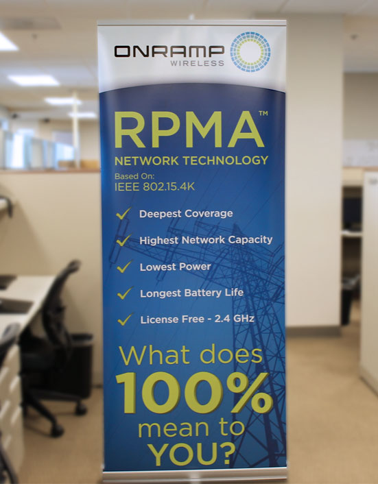
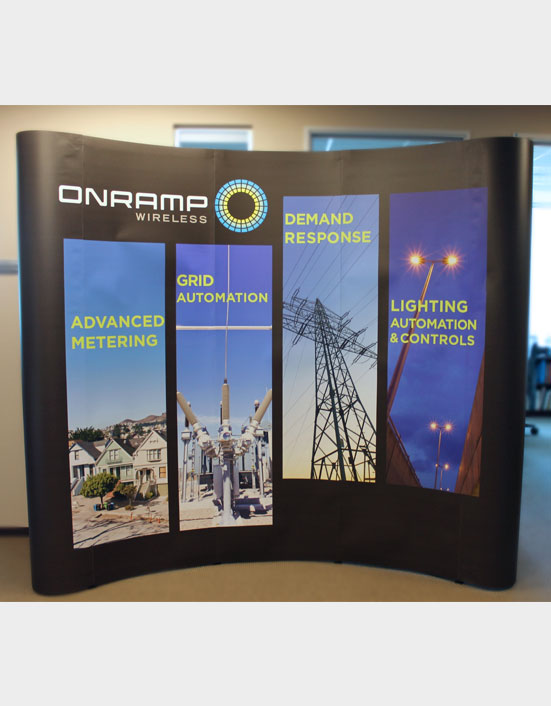
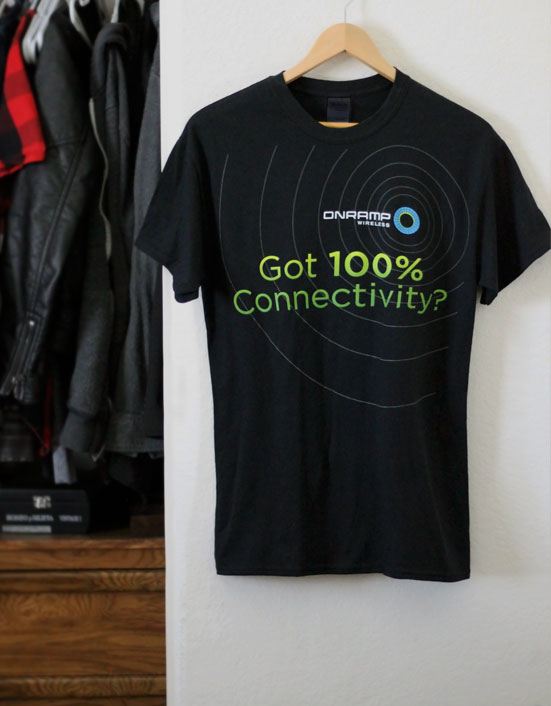
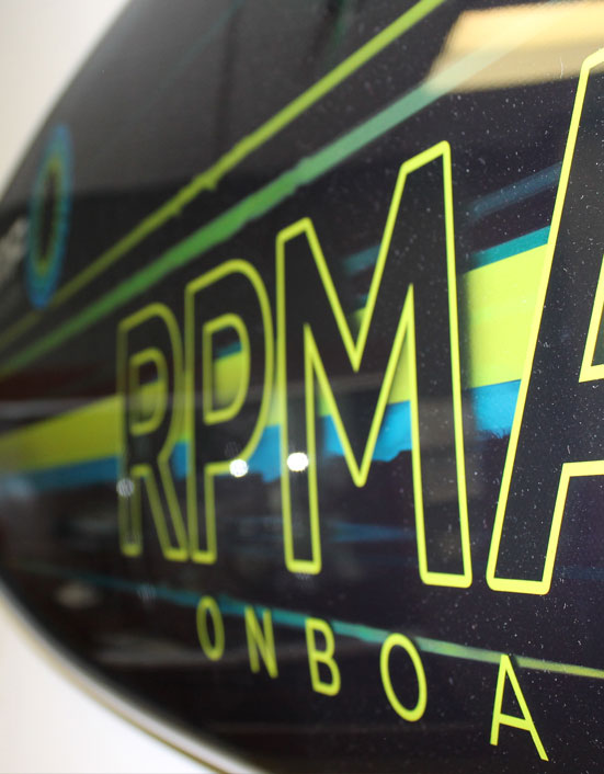
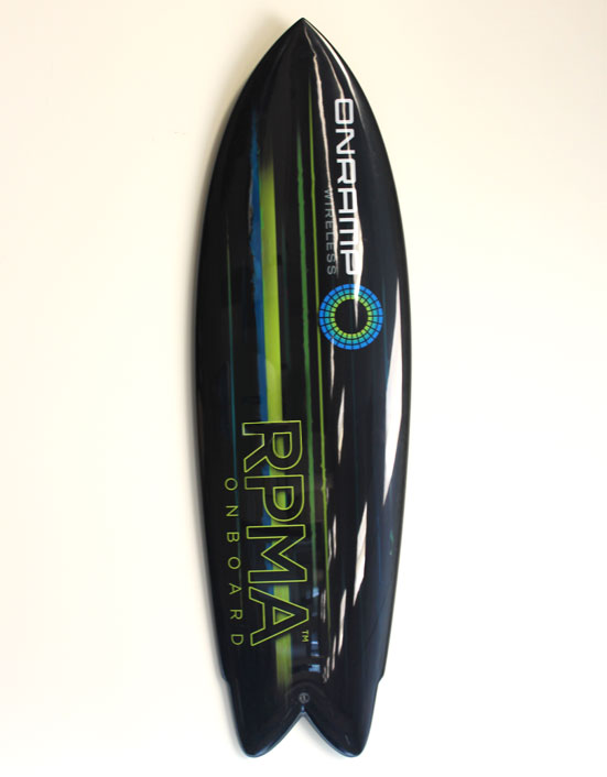
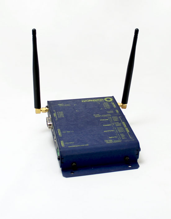
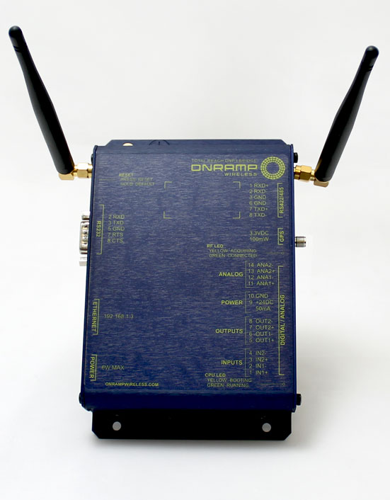
Creating designs for brochures, business cards, power-points and copy was pretty standard throughout my duration at On-Ramp, but as time progressed so did the variation of collateral. I created designs for not only trade show booths and materials but for their very first stand alone product and even surfboards that would represent the San Diego culture. I worked with a few engineers on the product design for the DNP3 Bridge which was an interesting experience. I did not have freedom to be very creative with the design unfortunately as most of the information needed to indicate where each input/output was located. The surfboard, however was completely thrown in my hands after the marketing team decided the RPMA on-board concept would play well with a surfboard (our technology that connected M2M computer boards). I used our branded colors and created what is represented as vigorously fast motion to convey the speed of our wireless technology. The boards have been used in trade shows and now can be found around the office.
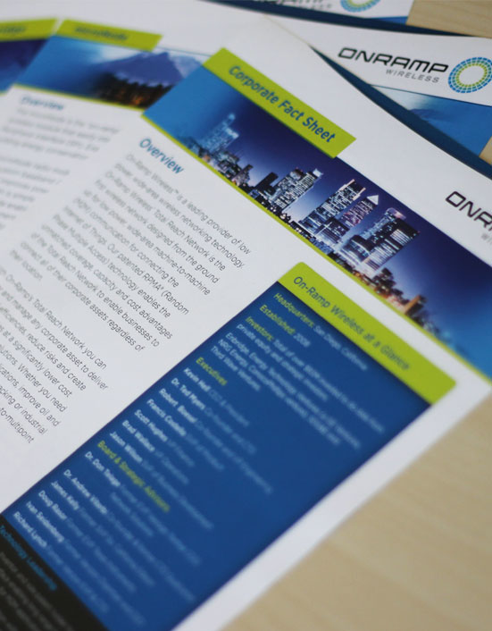
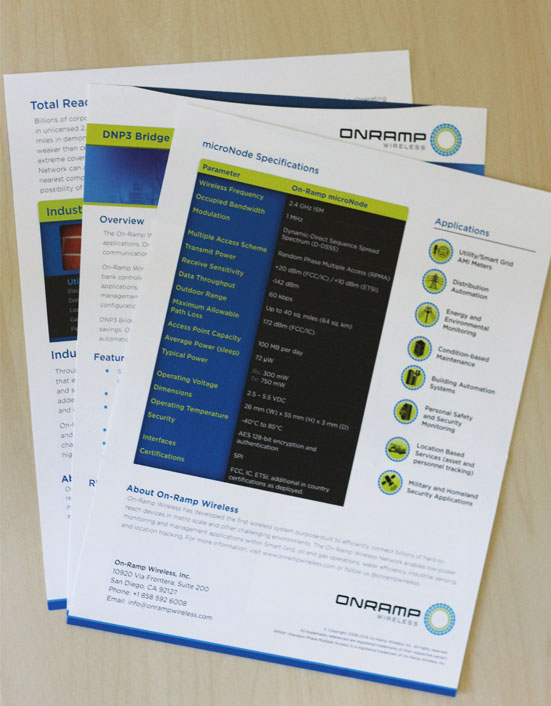
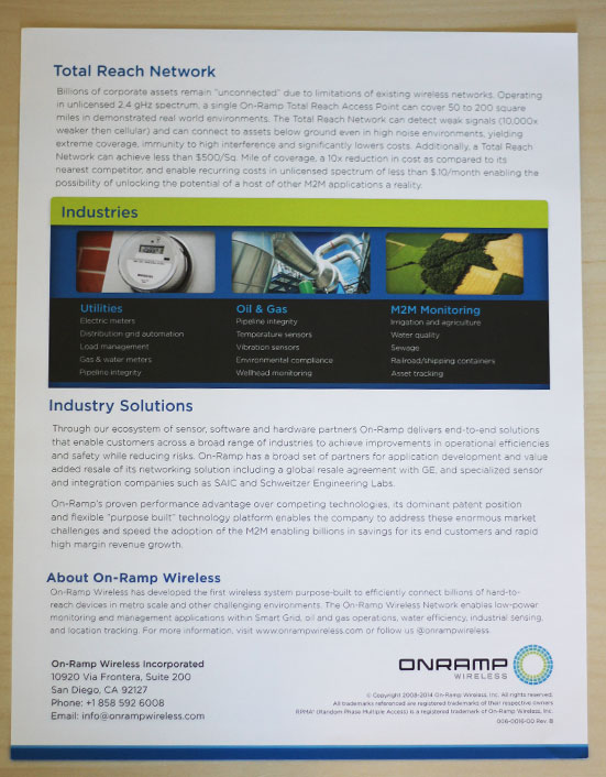
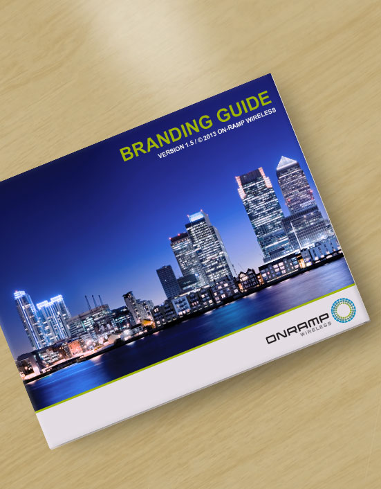
When I first began working for On-Ramp Wireless the marketing team wanted to completely revamp all of the existing collateral. We started with the product brochures and went through a few reiterations before we found a style that we both truly believed looked aesthetically pleasing while representing the company professionally. Working with the marketing manager on these projects was an experience I really enjoyed rather than working alone; I feel we both pushed each others visions and creativity and created a strong new style to represent the company. The most challenging aspect of designing these brochures was trying to balance the design and copy so that we could fit as much information per page as possible without making the brochures look overwhelmingly heavy on content. Eight different brochures were designed in total, the heaviest being 6 pages. We also created a detailed style guide that would assist employee's in carrying out a consistently branded style for future content.
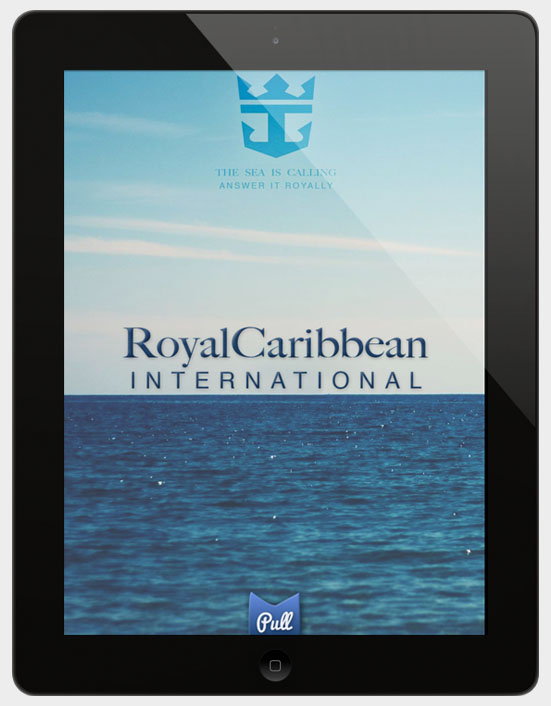
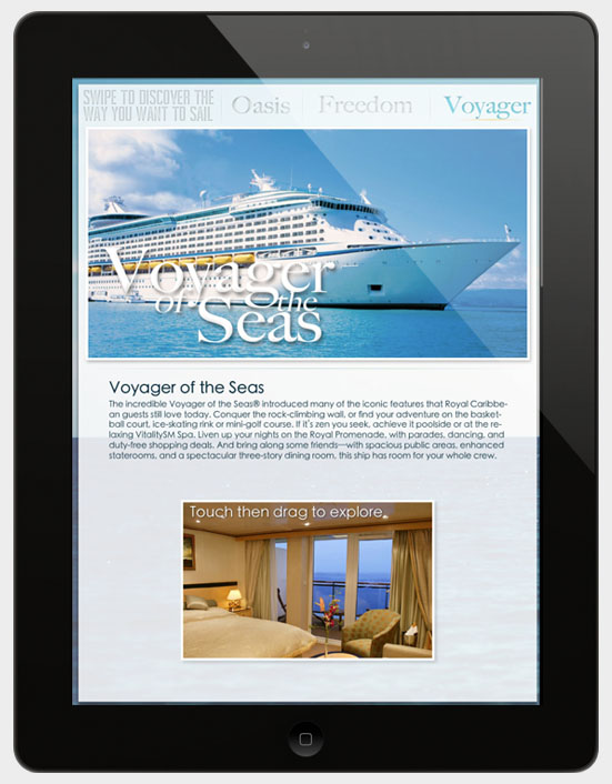
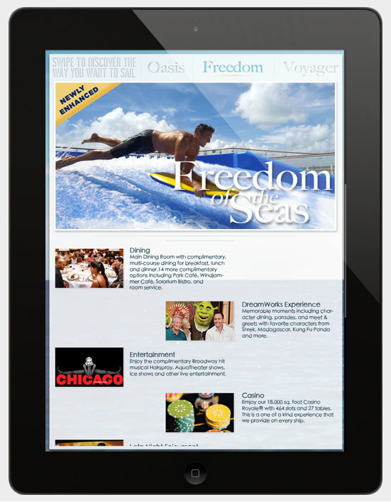
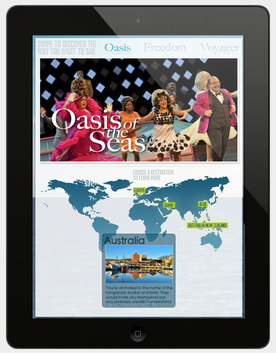
For our final project in the digital publishing class I had to create an application for a cruise line which I was randomly assigned. I had to display and advertise the amenities and features offered by Royal Caribbeans 3 largest cruise ships and the locations they traveled to. The home screen displayed a video upon the tab at the bottom being pulled up. After the video was finished you would be taken to a screen where you could explore each ship through pictures, descriptions and locations they ship traveled to as well as information about the locations. I wanted to create a simple to use application that gave off a very professional and elegant yet fun cruise ship vibe. Very little coding was done and most of the features were automated by adobe digital publishing application built with indesign.
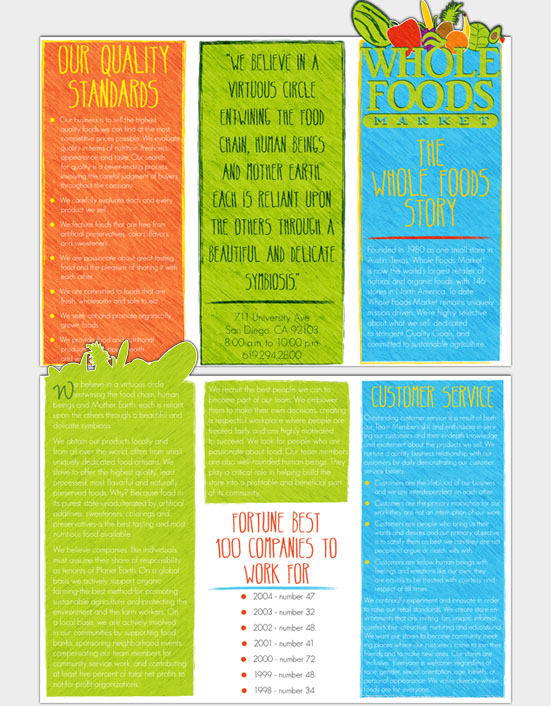
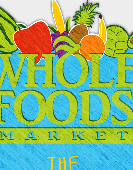
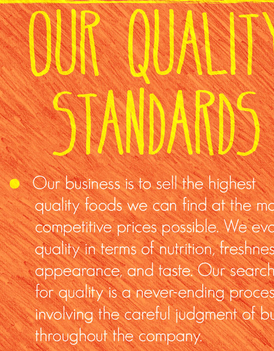
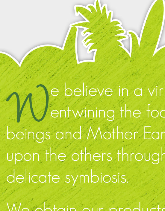
The project assigned was to create a 3 panel informational brochure that included a die cut. The brochure was randomly assigned and we had to incorporate all the content supplied. After researching Whole Foods I wanted to create an organic and colorful design to emulate the passion behind the company. I decided to use a colored pencil style and include a die cut around the fruit and vegetables on the front cover. The goal was to have the customer choose your brochure out of a pile of other designs strictly based upon appearance at first glance. This was another reason I implemented such a bright color pallet. The design was created in both adobe illustrator and photoshop and the typography and layout were created with adobe indesign.
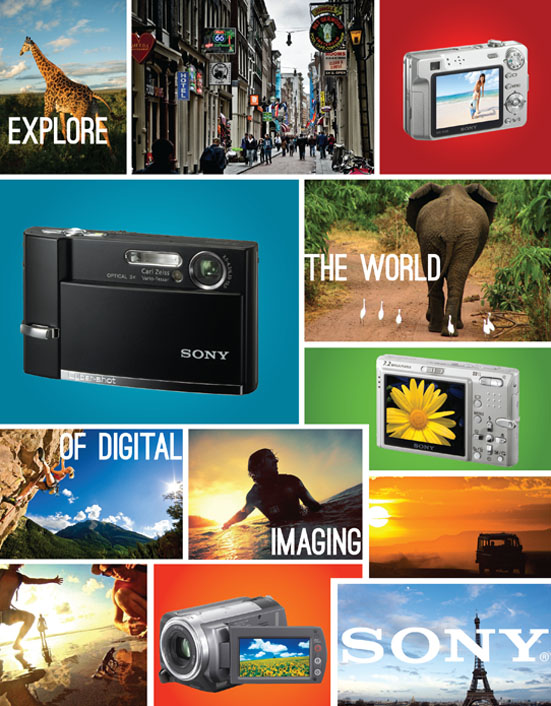
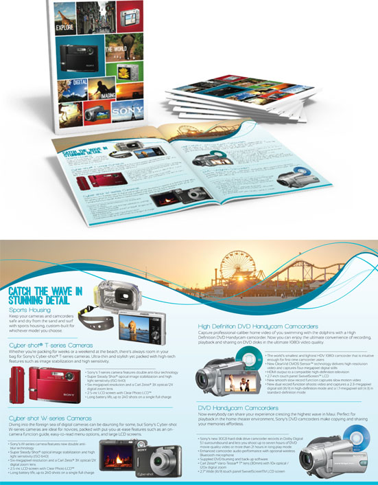
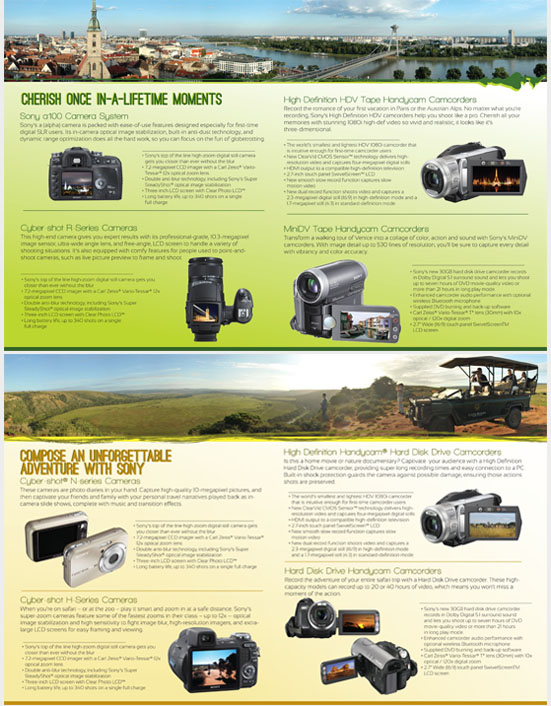
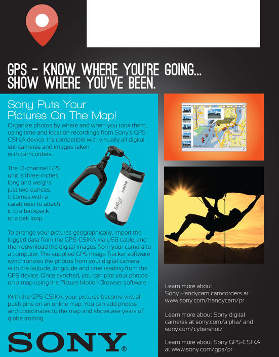
For our final project in our InDesign class our professor had assigned us in groups of three to redesign a random brochure. I was paired up with Reina, one of the stronger designers in the class, as well as a student who hardly showed up for class. We we're assigned the Sony camera catalog and had to include all the cameras and content you see in the incorporated. Once we grouped up I took the leadership role and designated the work between us three. We decided our theme would be "Explore the world of digital imaging with Sony" and that our spreads would consist of beach, safari, and foreign tourist locations. I quickly created the general layout for the spread and shared my design with the others for them to replicate. As fate would have it our partner didn't show, so after Reina and I completed our designated work I rushed to complete the left over uncompleted work. Overall I believe Reina and I were very prepared and organized so the project was successful.
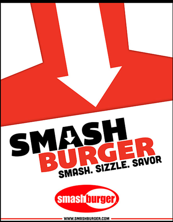
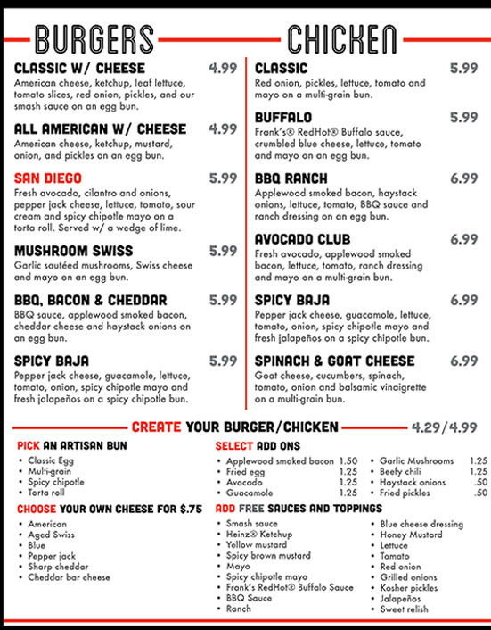
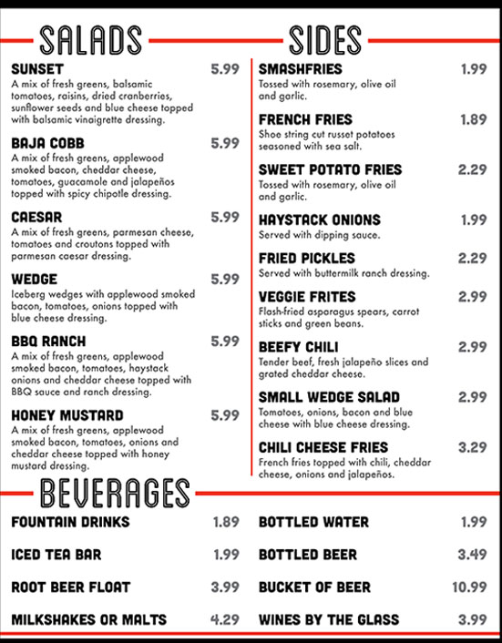
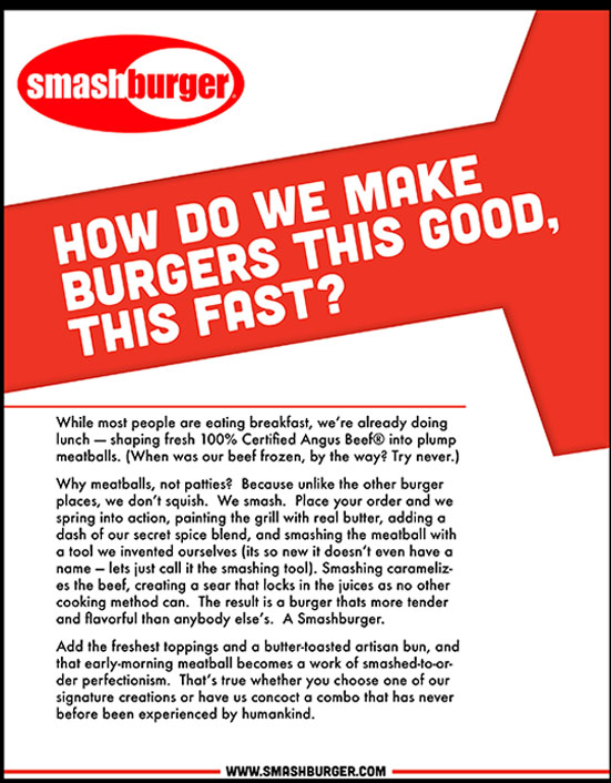
This assignment consisted of redesigning a previous restaurant menu. Around the time this menu was created Smashburger always said the secret to their success was behind the tool they used to literally smash their burgers with. I really wanted to implement that concept into my design so on the front and back cover I illustrated what I imagined the tool to look like. In an attempt to replicate the vibe Smashburger had to offer I spent a lot of time on typography, including font and color choice, as well as the overall layout design. The biggest struggle I battled was trying to fit every option/menu item on two pages without making the menu look unbalanced or crowded. The design elements were created in adobe illustrator and the typography and layout were created with adobe indesign.
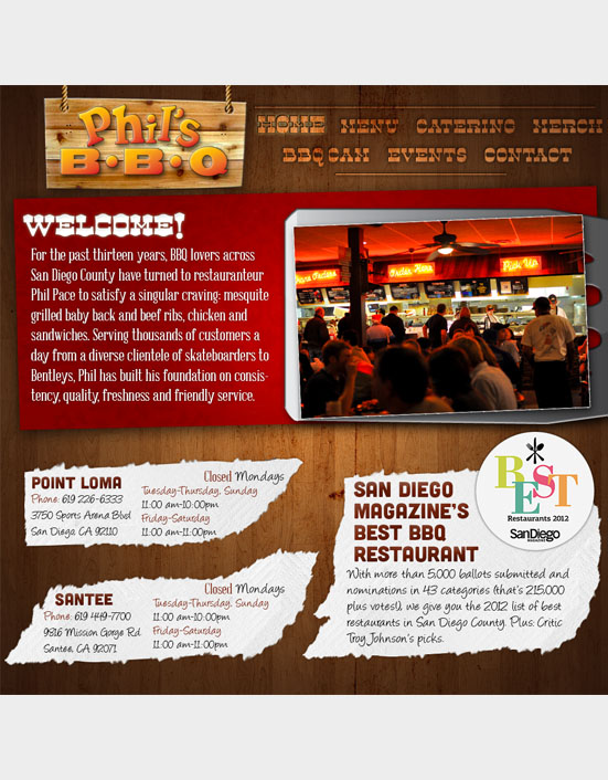
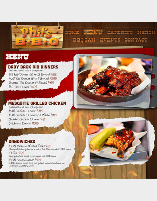
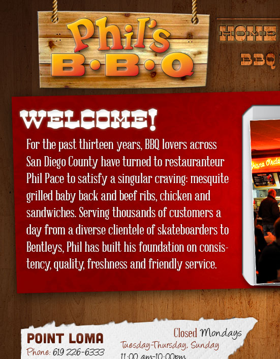
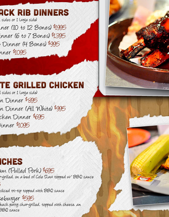
Prior to my web design classes this was my first project that I had to consider usability and design for. The assignment was to create an improved design for a website of our choice. Recently visiting Phil's BBQ and looking at their website I felt I could create a better design that really emulated the unique environment they offered in the restaurant. I used a lot of aspects I found in the restaurant including the paper towel pieces(they provide these instead of napkins), the wooden texture (seen throughout the restaurant), fire, a silverware pattern and the spatula pictured on the home page. I didn't have any coding experience prior to this design created entirely in adobe photoshop.
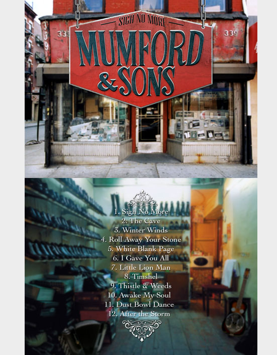
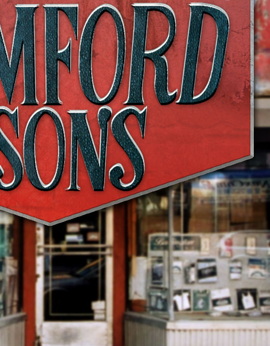
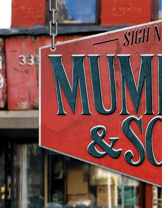
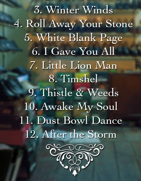
Shortly after completing my Monster book redesign I advanced to the next class and my first assignment was to redesign an album cover entirely in adobe photoshop. I had some experience prior to my schooling with photoshop and knowing that it was primarily an image processing application I wanted to create realistic looking album art. Being a huge fan of Mumford & Son's I quickly chose their album and began looking for an environment I felt matched their unique style. After editing the photo's I decided to create a sign for the shop I had chosen as well as another unique type face for this project. I added musical instruments to the back cover image that the band utilized in their music and altered the lighting to create a realistic effect. This project really helped me understand some important aspects of photoshop and lighting.
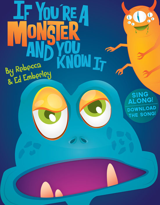
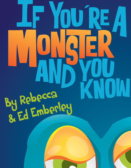
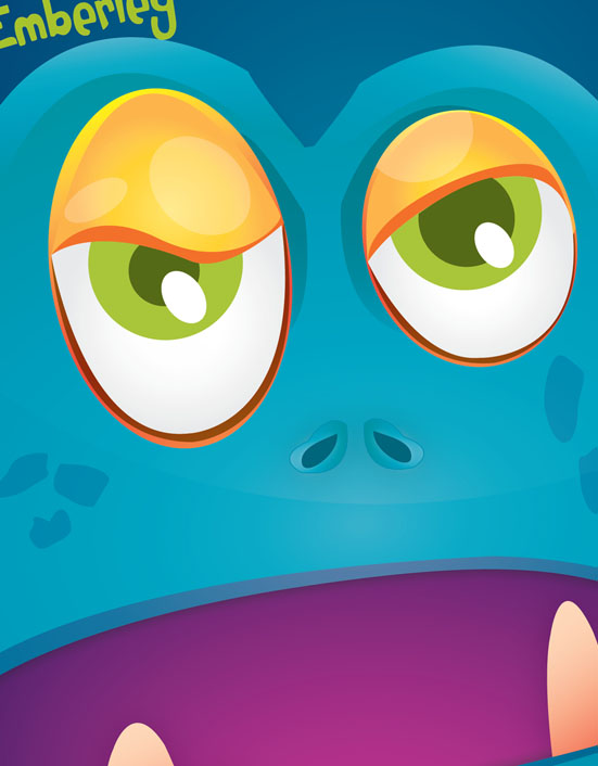
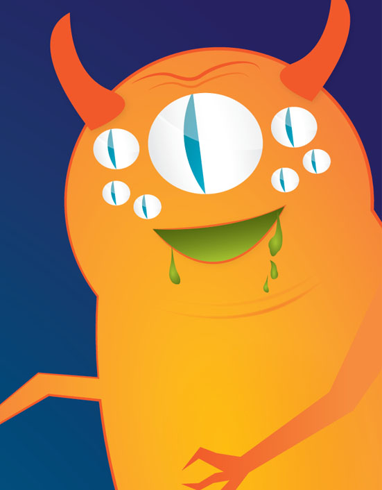
To redesign an existing book cover was the objective I undertook during this project. I chose to create an updated graphic for If You're a Monster and You Know It by Rebecca & Ed Emberley. The original book cover had a nice hierarchy but the art was poorly created. I decided to replicate the hierarchy while updating the graphics. I had illustrated the monsters pretty quickly so I decided to allocate the rest of my time creating a custom type face for the main font. This was easily the most challenging part of the project but I was very pleased with the outcome. This project was created entirely with adobe illustrator.
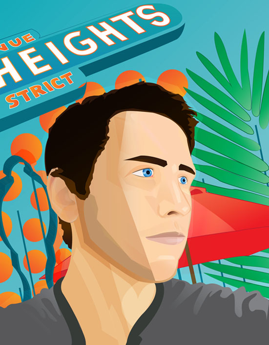
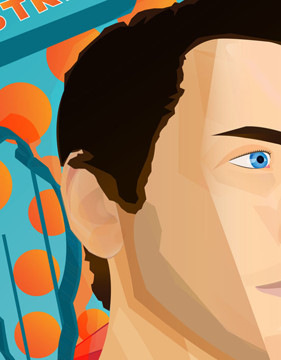
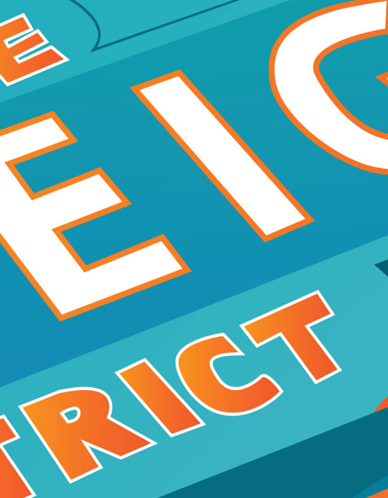
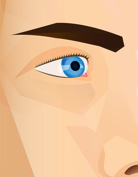
This piece was actually a combination of two separate projects I was assigned back to back. The first objective: to choose an area of town and try to replicate the environment through abstract art (I chose North Park) and the second projects objective consisted of illustrating a portrait (I went with a self portrait). I really enjoyed expressing my ideas through abstract art during the first project so I decided to carry that style over for my self portrait, which in the end is what ultimately inspired me to combine these projects into one unified piece. This project really helped me understand some important concepts behind color, lighting, and perspective. Created entirely with adobe illustrator.
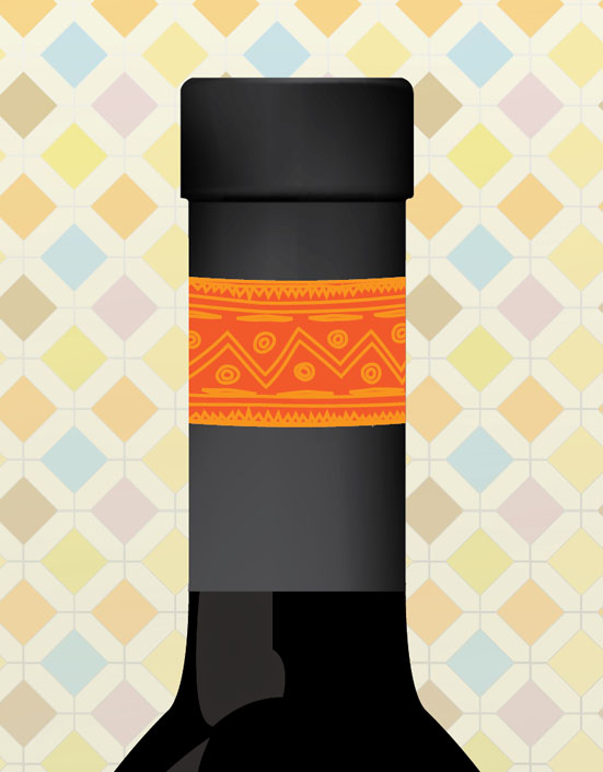
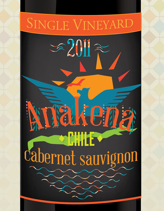
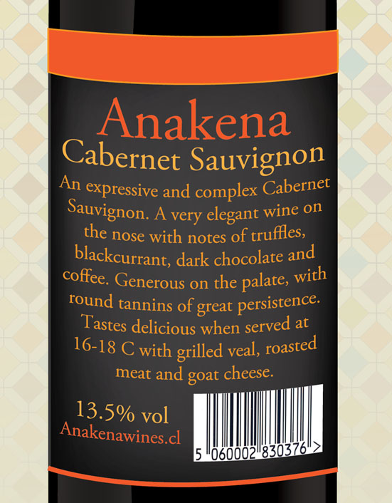
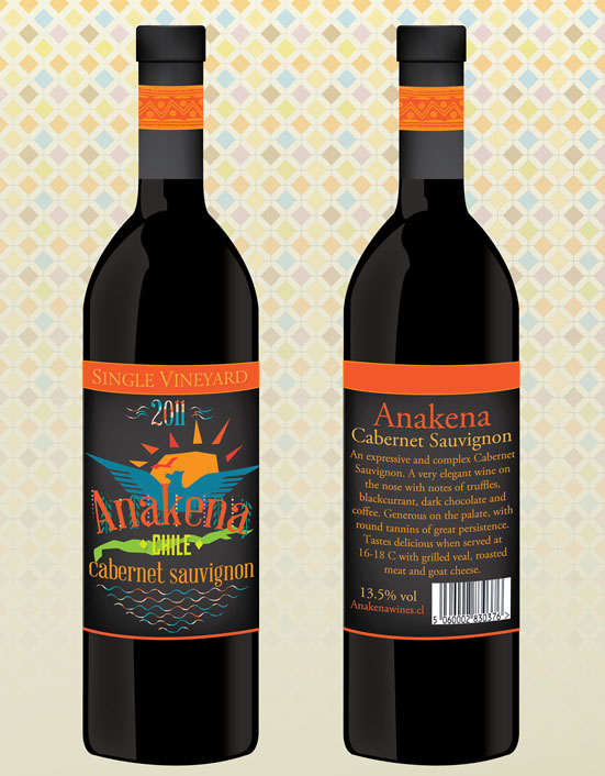
The project assigned was to create an improved design for a rather dull looking wine label. I chose Anakena's cabernet sauvignon because the original label was way too bland and boring. After thoroughly researching the Anakena Wine company I discovered their true passion for wine as well as their passion for Chilean culture. I really wanted to capture the vibrant culture that Chile had to offer in the design while also maintaining a nice balance between the graphical aspect and the typography. The new design I proposed will grab the customers attention easily while also expressing the Chilean culture. This project was created entirely with adobe illustrator.